Graph Your Data With Python and ggplot
This post was published 4 years ago. Download links are most likely obsolete. If that's the case, try asking the uploader to re-upload.

MP4 | Video: h264, 1280x720 | Audio: AAC, 44.1 KHz
Language: English | Size: 240 MB | Duration: 18 Lessons | 59m
In this course, you’ll learn how to use ggplot in Python to create data visualizations using a grammar of graphics. A grammar of graphics is a high-level tool that allows you to create data plots in an efficient and consistent way. It abstracts most low-level details, letting you focus on creating meaningful and beautiful visualizations for your data.
There are several Python packages that provide a grammar of graphics. This course focuses on plotnine since it’s one of the most mature ones. plotnine is based on ggplot2 from the R programming language, so if you have a background in R, then you can consider plotnine as the equivalent of ggplot2 in Python.
In this course, you’ll learn how to:
Install plotnine and Jupyter Notebook
Combine the different elements of the grammar of graphics
Use plotnine to create visualizations in an efficient and consistent way
Export your data visualizations to files
This course assumes that you already have some experience in Python and at least some knowledge of Jupyter Notebook and pandas. To get up to speed on these topics, check out Jupyter Notebook: An Introduction and Using Pandas and Python to Explore Your Dataset.
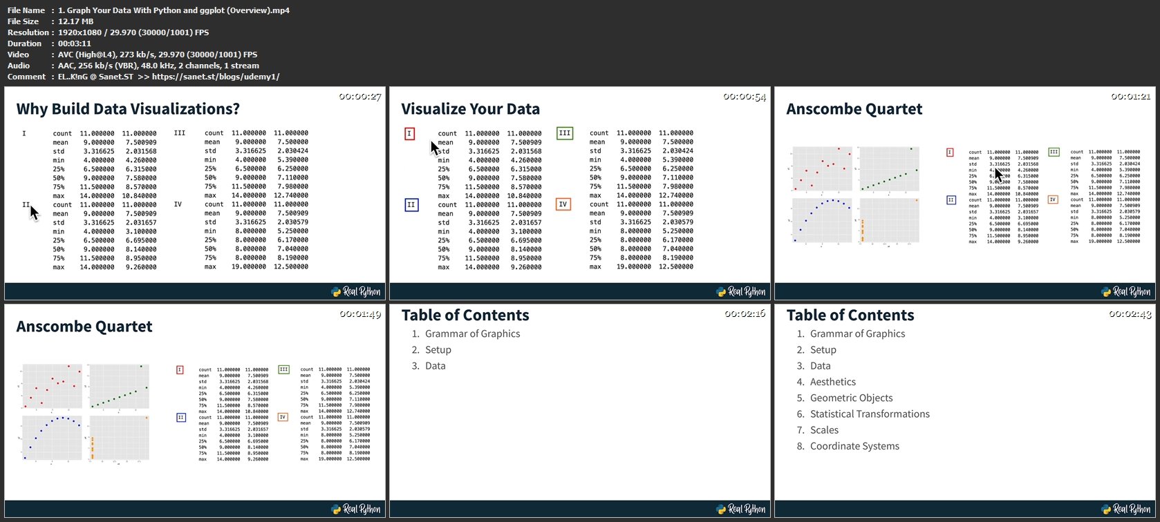
Screenshots
Homepage
Without You And Your Support We Can’t Continue
Thanks For Buying Premium From My Links For Support
Click >> Here & Visit My Blog Daily For More Udemy Tutorial. if You Need Update or Links Dead Don't Wait Just PM Me or Leave Comment at This Post
Quick check before we show the links
Helps us keep automated scrapers from hammering the filehosts.